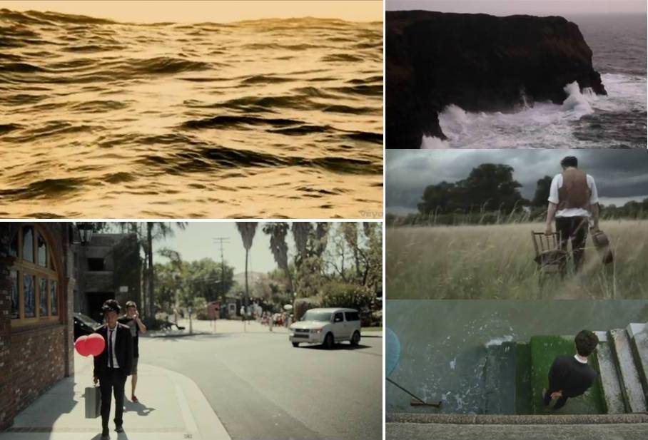
This is our rough copy for the music video we have made for the song Lover's Eyes which was orginally by Mumford & Sons but we used a cover of it that we found from youtube. As you can see from the rough copy we have had trouble with the balloon. We had some trouble make the shot all black and white with the red balloon being the only colour remaining. We tried some more effects to see if we could get the red balloon effect to work but we were again unable to make it work properly. We then decided to commission another past media student called James Corker. He was able to use the programme after effects to make the balloon a bright nice red standing out from the black and white background. We are then on adding these edited clips into premier to fit with the rest of the music video.
Wednesday, 19 December 2012
Rough Cut
This is our rough copy for the music video we have made for the song Lover's Eyes which was orginally by Mumford & Sons but we used a cover of it that we found from youtube. As you can see from the rough copy we have had trouble with the balloon. We had some trouble make the shot all black and white with the red balloon being the only colour remaining. We tried some more effects to see if we could get the red balloon effect to work but we were again unable to make it work properly. We then decided to commission another past media student called James Corker. He was able to use the programme after effects to make the balloon a bright nice red standing out from the black and white background. We are then on adding these edited clips into premier to fit with the rest of the music video.
Tuesday, 18 December 2012
Album cover ideas

This is another idea for our album cover. We looked at other existing album covers and thought about the place they positioned the text. We decided as a group that it looks better to position the artist name and album title in the left hand top corner of the picture. We think this makes it stand out more against the light blue sky but it still looks subtle and doesn't take any of the attention away from the beach picture. On this idea we decided to have the lettering all capital letters as this makes it a lot more easier to read and stand out well. In our research we also found that this was common in other indie pop album art such as Mumford & Sons Babel and Sigh No More. We put dashes either side of the artists name and we think it helps make the name a main focus and draws attention to it. We make the album name close to the artists name as it ties them together well and makes the whole text look almost like a logo. It also looks alot more professional.

This one is a lot like the first as we have decided we are wanting to have the text positioned the way it is in hese examples. We tried using capital lettering again for this one and made sure the artist name was bigger than the album art as we think that should be the main thing on the front cover. We also experimented by underlining the artsit name to again make it a main focus if someone was to look at the album.
Tuesday, 11 December 2012
Other album cover ideas

This is another idea we have tried for our album cover. We rearranged the album title and artist name in a different position to help find the best possible place for our final outcome. I think the artist name looks good on this example as it is positioned in the centre of the album cover making in the direct focus and evidently more important part of the cover. I think the text is really simple and nice and easy to read. Again the black text against the light coloured sky makes it more clear to read and stand out more. However I think the album title is maybe spaced out abit far from the artist name and it makes it looks to detached and not well thought out. This positioning makes it look like the text hasn't really been considered much and gives the thought that they have just been stuck on without considering the best possible place to make them look good.

I think this positioning is nice and subtle. The light sky makes the black font stand out a lot which makes it easier to read and more of the focus of the album cover. I think this position is the best place for the artist name and album cover to be as it doesn't take any focus away from the image of the beach but the position and colouring of the text still make them a main focus point. However i think the album title is spaced too far away from the artist name and looks too messy. For our next idea i think we will experience with positioning them closer together.
Monday, 10 December 2012
Filming
Today we were able to film the last bits we need for our music video.Our friend Ryan played the male character and Catherine played the female character. The clips we filmed are going to show the two being a couple and we decided to not use a tripod as we wanted the scenes showing the couple to have quite a hand held style to them. We filmed various shots showing the couple laughing and did a lot of close ups of their faces as we wanted to focus a lot on body language. We tried to be a bit more adventurous with filming this time and try and vary the shots up a lot more. For example on one part we did a medium close up of the couple feet walking across the grass and instead of just filming one shot of them walking from one point of view we decided to have it from behind the two as they walked as well as the side and once we edit this it will speed up just the small section instead of one long clip. We filmed in school but went on the back sports field that have a few tries and a large grassy field. We originally wanted to film in Newton Hall around some fields and grassy area but we were extremely delayed with getting this section filmed we decided to stick to filming in school to get it done and focus alot more on editing. We made sure we didn't get too much shots that showed the school as this way it gives it more of a better setting as we wanted to to be noticeably different from the shots showing the beach so it is evident that each section is at a different time and place. When editing we decided to edit the clips and give it a old fashioned vintage hand held style to it as we think it makes it seem more person than a normal style.
Sunday, 9 December 2012
Call sheet
Time to Meet
| 9:20 am. |
Location to meet
| Sixth Form Common Room |
Location
| Framwellgate |
Description of Location
| We are going to be using a long field, so we can highlight the depth of the freedom the couple had whilst being in a relationship. The field is isolated away, and is very basic which is all we wanted for these scenes. |
Group
| Ellie Snowdon, Sarah Hewitt, Kelly Senior and Catherine Kirk. |
Characters
| Catherine Kirk, playing the female in the music video and Ryan Hawkins playing the male lover. |
| Props | We dont need any probs for these scenes of footage. |
Special instructions
| Come prepeared even though the weather is supposed to be a little sunny, bring warm clothes just in case the actors have to stand around for a while. Toilets are nearby. |
Saturday, 8 December 2012
Album cover idea 1


We decided on the picture of the female character from our music video standing on the beach with two red balloon. We took this image while we were at the beach filming and we think its a really nice picture for a front cover as it is fitting with the music video and ties everything together well. We edited the image in instagram and this gave us a old fashioned simple and relaxing filter to it which links with the old fashioned hand held style filter we have used during some of the music video which shows the couple together. We used a picture of catherines character as it is the main focus of the music video and we want this to follow on through to the album artwork. We had her holding to red balloons and this is a iconic symbol that we are wanting to make frequent throughout the music video and advert and album artwork. We had a look at different positioning of the texts for the front cover and considered various different possibilities of where to put the artists name as well as the album name.We decided it was better to have the artists name bigger than the album title as this is the main part of it and the more important thing. However we have also tried have both of the writing quite large as this makes them more eyecatching and easier to read. We chose to used black font as this stands out against the background and makes it easier to read aswell as contrasting nicely against the light pastel style colours that are in the beach image. However we didn't want to take any focus away from the image of the female character holding the balloons as it is an important thing that we want to be able to be seen properly. I like this style of design because I think the 'the root of memories' album title flows well with the image and fits in perfectly at the bottom of the album cover. However I think that the artist name may be taking too much focus off the image and taking too much room up so we are going to make it smaller and in a different position in our next example idea.
Thursday, 6 December 2012
Possible Album Cover 2

This image is another possible album cover we are considering. We took this picture when we were filming at South Shields beach and it shows Catherine's character with two red balloon. However during the music video and the rest of the digi-pak ideas we only wanted one red balloon to keep it simple. If this is an image we are going to use of the actual album cover then we will probably edit the picture in photoshop to remove the second balloon. We have also been looking at different effect filters that make the pictures we have took more striking and eye catching.
Wednesday, 5 December 2012
Ellie Goulding Research
In the video for the cover of Your Song by Ellie Goulding
there is close up and extreme close ups throughout alot of the video. This is
effective and shows the emotion of the person and how the song effects her
feelings. This video has an interesting old fashioned hand held style camera
that is used frequently for various shots throughout. This really gives off a
warm and calm emotion to it and also works by involving the viewer into the
song and the narrative. This effect also fits well with the mood of the song
itself and how it has quite personal lyrics.


The Lighting used throughout is also quite bright and makes
the narrative a more happy and pleasant feel. The bright light that can be seen
on the singers face connotes happiness and the hope of the love she is singing
about.
There is also various naturalistic style shots used of
things such as trees and the environment. This makes the whole music video have
a more normal realistic style to it. The singer can also be seen wearing normal
clothing which makes her almost more connected to the audience and the people
listening to the song. It also makes the narrative and the song more relatable
which makes it have more of an emotional impact upon the viewer.

This music video also relates almost directly to the lyrics
of the song. For example the lyrics are ‘i’ll buy a big house where we both can
live’ and it then shows the singing at home with the person she is singing
about. I think this is an effective thing to use when creating a music video as
it really involves the audience and makes the music video more recognisable and
memorable after it has been watched. Over all this music video tend to stick to
a slow and calm feel that works really well with the melody of the song.

Mumford & Sons


These of some of the images we took at a Mumford & Sons concert we all went to on tuesday night. Because we are all fans of this bands made it better for research and getting ideas for our media project of an indie pop genre. We picked a Mumford & Sons song and found a cover for it and when we were able to bring in alot of the style that the actual band have. For example when we went to see them there was a row of lights over the top of the crowd as you can see on the image. This made the whole set have quite a carnival festival style theme. The plain lighting made the stage look quite simple and relaxing feel and this is the type of thing we want to represent through our whole media project. I think from going to see Mumford & Sons its given us all as a group some better ideas and more of an insight into how the band represent themselves and the feel and theme they have went for.
Possible Album Back

This is one of our ideas for a possible album back cover. We wanted to still go with the beach setting and location as this fits perfect with the music video aswell as the rest of the album art. We think its a good idea to have this beach setting a frequent thing throughout our project as it because quite symbolic and memorable. We chose to have the beach setting for our music video as the main location as it is known to be quite a relaxing and peaceful place which is what we want the audience to feel when watching it.
We made the album title in large font as it makes it the focus of attention for the album.We made the font of the song names positioned landscape as this then makes it flow better with the image of the beach. We picked black font as this stands out better against the light sky on the image.
Artist Name
We all decided in a group that the name Elliot Guy fits well for our artist name. We chose to do this because when doing our genre and artist research we found that most indie pop artists stick to the name as being the name of the actual singer rather than anything made up. We thought this particular name went well as it was a normal name that also gives a nice normal and laid back feel. We made sure the name was fitting for a male artist as this is the gender we have chosen.
Elliot Guy
We think this style of writing links and goes well with the writing we were looking at for the album front cover. This writing is quite simple and spaced out well which makes it easier to read. The thin font also makes it sharp and strinking which will make it more eye catching to the audience.
Elliot Guy
This writing is more vintage and old fashioned than the other ones we have looked at and this links well with whole style of the music video aswell as the genre we have picked and ties the clothing, style of the song and narrative altogether effectively. However this writing may be slightly too feminine for our artist as we have chosen a male singer, but again this could make it more effective as the storyline and the song we have chosen itself is quite girly and focuses alot on love.
Elliot Guy
We think this writing is good because its quite thick and bold and this makes it more eye catching and shows its the focus of the album as it is the artist. We think this will also stand our well against the picture of the beach background.
Tuesday, 4 December 2012
Using location pictures
When reviewing the locations pictures that were taken on the location scout we all agreed they were of really good quality and would be perfect as the images included in our digi pak. Because we wanted to make sure our whole project tied together well and each separate product had a clear link and connection to the other using the beach photos was a good way to connect the digi pak artwork to the music video. We also found during our researching into the indie pop genre that it was common for artists to use photos and real life imagery in their artwork rather than animated 'cartoon' style like other genres tend to. This meant by using the beach photos we were fitting well to our genre and it would help distinguish and make our products recognisable to people who liked this genre of music.
We have also been looking into the idea of using a software we have on our phones called Instagram to put a filter effect over the image. We did this using one beach image and it works really well and makes the picture seem alot more warm and calm.
We have also been looking into the idea of using a software we have on our phones called Instagram to put a filter effect over the image. We did this using one beach image and it works really well and makes the picture seem alot more warm and calm.
Possible album cover

This is another image we are using in our album digi-pak. Ellie took this image when she went location scouting and we think that the colours tie in well with the other images we have and also the fact that the sun is beginning to set gives a calm and relaxing feel which is the mood we are wanting to portray. This image gives an all round peaceful feel to it and this also links with the style of music our genre and artist is aswell as the song we have picked for the music video. This image is one of our possibilties for the front album art cover however we are worried that it could be slightly too boring for a front cover and we are wanting something eye catching. We also have another image of Catherines female character holding the red balloon and this is also another image we are considering using for the front cover, however we have not got round to uploading it yet as it was taken on a phone.
Monday, 3 December 2012
Clouds
While doing our research we looked at the music video for Ben Howards Song The Old Pine and this give us some ideas for our music video. In the video there is various shots throughout showing the sky and the clouds moving in fast motion and we think this looked extremely good and because we are having the narrative of our music video to be about the female character reminiscing about her past relationship we think it would be a really good idea to try and use this type of thing in our music video to show the difference in time as well as it representing the change in the character since the relationship ended and how she is also moving on herself. We set up the camera in school outside of our media classroom and had it pointing at the sky. It was a relatively nice day so the sky was blue with clouds. We left the camera running for the majority of the lesson to try and capture as much movement in the clouds as possible so when we sped it up it showed a lot of fast change in the clip. However once we looked back over the footage it didn't show the clouds moving as much as we wanted to and the clip kept zooming in and out in order to try and pick something to focus on. We decided we will set the camera up again but pick a slightly windy day as this will give the clouds more movement. We will also switch the auto focus off the video camera and this should stop it from trying to focus and the clip will then be still. We considered possible places to set up the camera in order to get the best possible footage of the sky and we think it would be a good idea to set it up in one of our garden on a tripod. This will then stop anything from being in the footage we are recording and also give us more time to film and therefore better movement of the clouds once we speed it up.
http://vimeo.com/22163776
This is the link for the video Old Pine showing the clouds.
Thursday, 29 November 2012
The Root of Memories
For the album title we have chosen to call it 'the root of memories' we picked this video from a advert we saw while we were filming in south shields beach and we think its a really nice saying and it works extremely well with all our ideas. For example we have based the whole of the music video around the female character reminising about her past relationships and the scenes that show her flash backs show the memories the couple shared together so this links the album title with the music video narrative. It also fits perfectly with our theme and the indie pop genre as this style of narrative is usually frequent in many indie pop music videos as we found when researching.
This font is our least favourite as a group but we wanted to try a variety of different fonts instead of limiting ourselves to the same style. However we discussed as a group and all think this style may be slightly too feminine for the album title front cover as the cover we got and the artist we have is male. However this is an interesting and nice font so we may be using it somewhere in the digi-pak.
This writing is more of a masculine style and this is the type of thing we are heading for. It is clear to read and the thick boldness makes it very eye catching. It is also quite a old fashioned style as it reminds me of a type writer type of font and this will fit well with everything else we have included in our music video that goes with the old fashioned theme such as the females clothing and the rest of the album digi-pak art. We think this font would look extremely good against the simple romantic background of either the sun set or the beach setting but we have not decided which of theme pictures we want yet.
The
Root of Memories
This font is our least favourite as a group but we wanted to try a variety of different fonts instead of limiting ourselves to the same style. However we discussed as a group and all think this style may be slightly too feminine for the album title front cover as the cover we got and the artist we have is male. However this is an interesting and nice font so we may be using it somewhere in the digi-pak.
The
Root of Memories
This writing is more of a masculine style and this is the type of thing we are heading for. It is clear to read and the thick boldness makes it very eye catching. It is also quite a old fashioned style as it reminds me of a type writer type of font and this will fit well with everything else we have included in our music video that goes with the old fashioned theme such as the females clothing and the rest of the album digi-pak art. We think this font would look extremely good against the simple romantic background of either the sun set or the beach setting but we have not decided which of theme pictures we want yet.
The
Root of
Memories
With this font i think it works well with the spacing. We have chosen to use different font sizes and make the 'memories' part in larger font and positioned underneath and more spaced out than the rest. This then makes this work inparticular the focus of the title and gives the audience or anyone who read it a insight into what the album is about. Also the fact that the font is large bold and spaced out makes it easier to read. It is also alot more masculine that the first font we looked at and this then makes it more obvious that it is an album of a male artist more anyone listens to the music. This style is more straight cut and easier to read than the first but not as straight as the second as it still has a vintage look to it as it is slightly squirled and i think this makes it still masculine but also something girls can listen to as it is a album about love and memories.
Please comment and give us an idea of what font you think is better.
Digi-Pack Pictures


These are some of the pictures we took when filming at South Shields beach. We all decided these were some of the pictures we wanted to use in the digi-pak. We think it would be nice to use quite a simple image of the beach because these naturalistic and simple theme is quite common for many indie pop album pictures. Also we took these pictures while we were filming at the beach so it all links together with the beach setting and enviroment. We used a app on an iphone called 'Instagram' and this let us put a nice effect over the image. For the image of the poster we saw at South Shields we used a filter that gave an old fashioned vintage colouring and style to it and this is the theme we are going to stick to for the whole album art, digi-pak and magazine advert and this will help all of our project tie in well together.
Balloon problems

When it came to editing the clip with the female character and the red balloon we added the 'leave colour' effect that we had been using successfully on previous clips and and we found that because we had to mess around with the contrast and brightness of the clip to make it look better this effected the 'leave colour' effect and lead to it not working. We obviously wanted to just leave the red balloon as the only colour in the clip as this is something we are using through out as i have talked about in previous blog posts but because it was a sunny day when we changed the contrast to a better colour it then made various parts of the characters face and hair remain the same colour as the balloon and this then doesnt give the red balloon effect we are really wanting to use. We are on working together to find another solution to using this effect and using the internet to help us with various tutorials that will give us the same result. Hopefully this won't effect the red balloon idea and we will find a solution soon.
Wednesday, 28 November 2012
Black and white test
This is a quick video I put together t show a couple of the beach shots we are using during the black and white part of the video. I think since we added this effect it makes the video look alot clearer and gives the video a more meloncholy and quite calm feeling which is the mood we are wanting to portray to the audience. While we were filming we took quite a few shots of various little bits of things we found on the beach such as the stone/rock things you can see in this clip. We thought it would be good to include quite a few stop snaps of these throughout the whole music video and this would make the naturalistic theme we are wanted come through more. We picked this type of idea when we did our research into the genre. I looked at the music video for Old Pine by Ben Howard and this type of thing is frequent throughout and that influences us to include a similar thing but at the beach for our music video.
Monday, 26 November 2012
Red Balloon 'Leave colour' effect

Before we had filmed all the shots at the beach with Catherine and the balloon we tested our the effect to make the shot black and white but with the remaining red. We did this on a picture of a poppy using the effect in Adobe Premier called 'Matte' this worked fine and we were hoping it would work the same for the balloon. However when we were filming it was a windy day and this made the balloon move a lot. When we went to use the same 'matte' effect on Premier it didnt work properly due to this problem. We then worked as a group to play around with other effects and other ways to do the red balloon idea and finally we were able to work out another way which was called 'leave colour' and this did the same thing that it had with the poppy.
Wednesday, 21 November 2012
Retrospective overview
From
the beginning of the music video project me and my group have researched in a
lot of detail the codes and conventions of the indie pop genre and identified what makes it different from other genres. For example I looked at various
artists and bands that go by this genre and picked out certain
things that are saw commonly used throughout their style, existing music videos
and adverts. I found that the majority if not all music videos featured a heavy
naturalistic feel throughout and this is most evident in artists such as Ben
Howard, Mumford and Sons, Lana Del Rey and Noah and the Whale that i have done
most of my research on.
I also identified that there tends to be a narrative
focusing on love throughout the music videos and songs of indie pop artists and
this has helped build on ideas for mine and my groups music video. We chose our
main location to be a beach as this fits in well with the naturalistic feel and
tranquil style that is common for this genre and we have focused the narrative
around Catherine’s female character and Ryan’s male characters past
relationship. I found that a lot of music videos and album art of artists going
by this genre that feature one significant object whether it be an instrument that
is frequently used or a balloon which is what we have chosen to be the main
symbol of our project. We thought it was a good idea to use this as it
represents the idea of love with the red colour and it is something that the
female character will be seen holding throughout the music video until the end
when we releases it which will signify her moving on and letting go of her past
relationship. This narrative that we have chosen fits in well with the song
Lover’s Eyes by Mumford and Sons as it is a song about love. We also chose the
female character’s clothing around the indie pop genre by dressing her in
vintage style clothing as we found this was something that was common in people
featured in indie pop music videos such as the artists themselves or the
characters that the music video focuses on. We also decided to use the balloon
throughout the digi-pak and the advert as research has also shown that there
tends to be a theme throughout a lot of artists work and music and this will
make our project fit in well with existing indie pop work.
Tuesday, 13 November 2012
Footage overview
Today we looked through all the footage we got from filming on Sunday and we were all pleased with the majority of the shots as they captured the location well. However we think that when we film our second set of footage that will involve all the scenes of the couple we will use more adventurous shots because we seemed to limit a lot of the beach footage to simple pans and close ups. However these shots are still useful and effective because they show the setting perfectly. We are going to use a variety of shots for the second set of filming and hopefully this will enable us to boost up our grades and getting a higher level and give us a good final outcome.
First part of filming
We completed our first part of filming on Sunday at south shields beach. We think we got some good footage because it was a nice day and it made the beach look good. Unfortunately we had some problems with the wind and the balloon but we think we got some good shots regardless however it may make the effect we are wanting to use harder to add. We hired out two cameras to use when filming because this would allow us to get as much footage as possible. We each took turns filming various shots of either Catherine's character walking around the beach with the balloon or some simple pans and close ups of the beach and the sea and we followed our storyboard as well as added some other effective shots that we thought looked good. Luckily the beach was quite empty so we didn't have any problems of people being in the shots when we didn't want them to be. Today in our lesson we went through the footage from the first camera and deleted anything we didn't want and made a folder with some behind the scenes shots of how we filmed things and explaining why we did them.
Saturday, 10 November 2012
Camera problem
Unfortunely we switched one of the cameras on tonight and it was flat and we had some difficulty getting the battery out to charge, luckily we managed to and we are now charging it for filming tomorrow.
Thursday, 8 November 2012
Filming delay
We had orginally planned to have our friend Ryan Hawkins with us today so we could film the shots that were the females flash backs of her past relationship, however he is extremely ill so we are delaying it till he is feeling better. Fortunately this will not set us back too far as we are still planning on filming the beach shots at the weekend and that is going to be the majority of what the music video is focusing on so when it comes to getting the shots involving the male it won't take long.
Wednesday, 7 November 2012
Contingency idea
Me and my group have decided it would be a sensible idea to
come up with a back –up plan in case we are prevented from filming at the beach
due to various reasons such as the weather or any other problems that may
occur. We decided we would film on a setting similar to our secondary location
that is a nature reserve with plenty fields and woods etc. However it may make
the music video less effective as we will have to be cautious that the
secondary location showing the past relationship of the female character reminiscing
is noticeably different so the audience understands that the two parts that
will be featured throughout the music video are two different places and times.
We will still be using the balloon idea as we think when it comes to editing
and having it the only colour in that part of the video it will look effective
and help tie the music video in well with the digi pack/album art and advert we
will also be producing. We have briefly looked at the location for our back up
plan and we are still able to get some similar shots to our initial idea. Fortunately
we will still be able to keep the scenes of the female character walking around
alone in black and white and this will make it a clear difference from the
scenes of the character looking back at the past relationship that will be in
colour. We will also make sure the female is shown wearing different clothing
when it is the scenes showing her in the past and this will also help make it
evident that it is her reminiscing.
Call sheet x3
| Time to meet | 9.45am 11th November |
|
|
|
|
|
|
|
|
|
Filming Sunday 11th

We checked the weather for Sunday the 11th of november and it seems to be good weather so we decided this is definitely the day we are going to go and film at the beach.
Tuesday, 6 November 2012


Saturday, 3 November 2012
Filming delay
We met up as planned today to film the beach scenes but unfortuntely once we got to the beach it was raining and this prevented us from getting any good clips so we have moved filming till next sunday which will be the 11th of november. We will be making another call sheet with the information on for the next day of filming and hopefully the weather will stay nice!
Monday, 29 October 2012
Call Sheet x2
Second Location (Featuring male)
There will be two locations featured in our music video. We are using the beach for the setting that will be featured in black and white and show Catherine's character looking back to her past relationship. The second location is going to be when we have Ryan's character in. This will be when we are showing Catherine's characters past relationship. We will have all the clips that are showing the past relationship in colour. This is to represent the happy feel of the couple. We have not yet properly looked into the location we will be using for this part of the musiv video but we are familar with the surroundings so we will have no problem finding a good setting. We are wanting to have somewhere with fields and a peaceful setting, this will link well with the beach setting aswell and tie the whole music video together.
Friday, 26 October 2012
Location
We have chosen to film on South Shields beach. We chose this setting becasue the beach is a nice pleasant beach with a light house and ruins near by. These will be good things to include in some shots throughout the music video. We are either getting a lift from a friend or the train/bus to the beach and we are going at no later than 10 in the morning because we don't want the dark nights being a problem for filming. On our location scout we found plenty toilets and food places nearby. We are going to get plently shots of the waves and of Catherines character walking around the beach, this will all give us some good short shots of the setting and represent the tranquil and natural feel we are wanting to get.
Tuesday, 23 October 2012
Our Logo

Thursday, 18 October 2012
Beach location images


Last week Ellie went out to south sheilds beach to get some good pictures of the beach location we are wanting to use in our music video. The pictures we got show the beach and the sea itself which we are wanting to get some nice shots showing the waves which helps build the naturalistic feel that we are aiming for. We also found a nice path that we thing will be good to have the female character walking down when we first see her before she begins reminising about her past relationship. The beach is an ideal location for the mellow and relaxed feel that we want to portray seen as though a lot of people associate the sea as a relaxing place to be. Ellie also found some ruins at the beach and these will be very nice to include to give the music video a vintage old fashioned feel and also it will give us the opportunity to experiment with some interesting shots that we haven't used in past media projects.

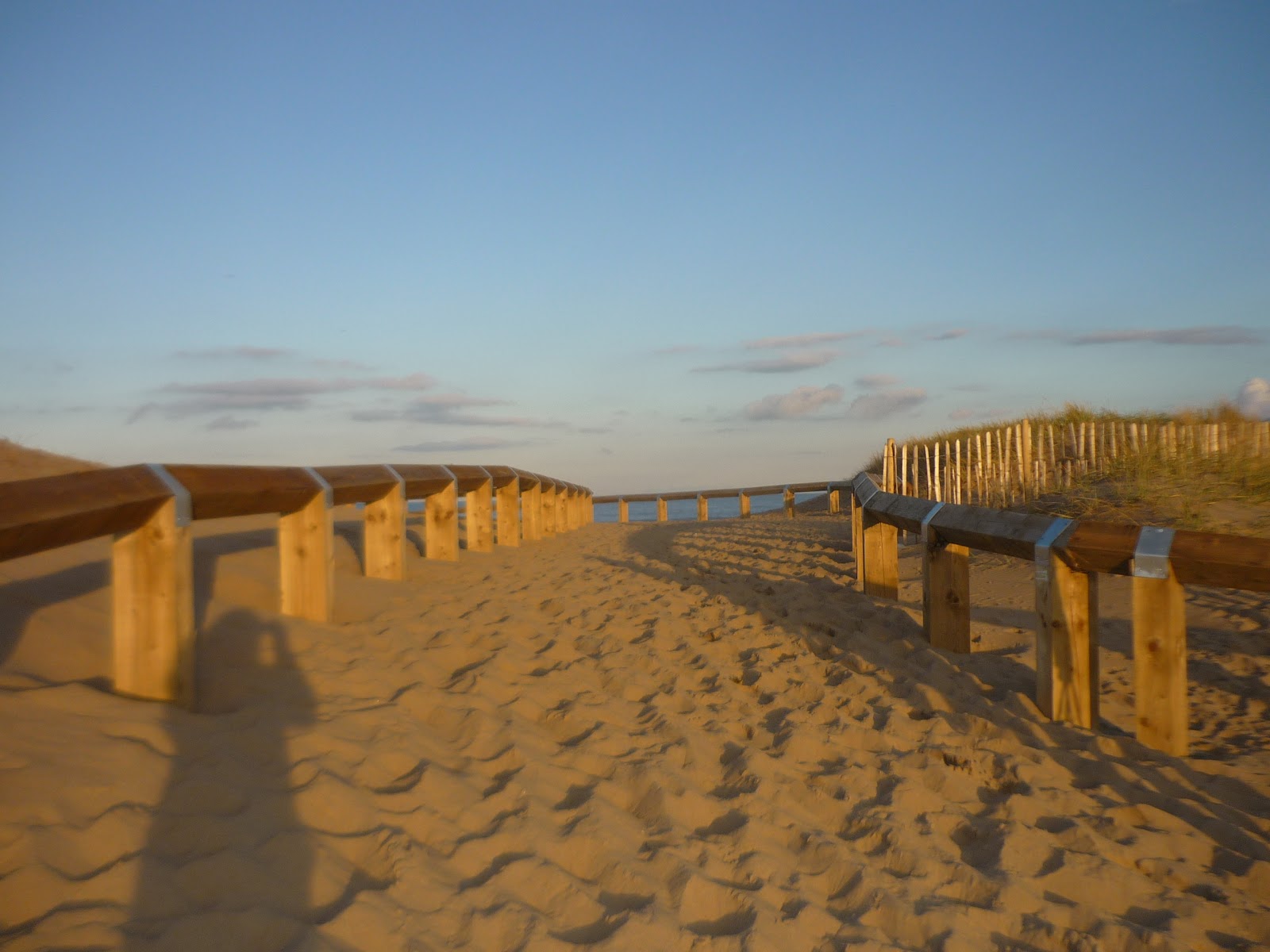
When looking through the pictures Ellie got of the beach location we found this shot and the sunset gives the sky a nice relaxing feel and we were thinking we would try and include this in our music video at some point even though it is a still shot. However we don't know if this would be possible as it could effect our continuity.
Subscribe to:
Comments (Atom)