|
|
|
|
|
|
|
|
|
|
|
|
|
|
|
|
|
|
|
|
|
|
|
|
Wednesday, 17 October 2012
Call Sheet

Tuesday, 16 October 2012
Treatment
Plot
The focus of the music video is going to be the downfall of the females relationship. We will begin with showing her walking along a beach, this part is going to be shot in black and white to show the mellow and sad feel to this part of the story showing her alone and evidently missing her past boyfriend. We will then get some long shots and hopefully some good pans to show the location we have picked which is the sea side. We want to make nature a big feature of the whole music video so the location we have picked is good for this theme. We decided on the naturalistic style because it will give the whole musiv video tranquil relaxing feel. We want to get good shots of the waves in the sea and the light house that we found at the beach we picked. As the music video goes on we will show the female character sitting on a bench and this will be the point where she first starts to reminise. This is where we will have the male character come in as this is the boy from the relationship that she is looking back at and we will make this part of the music video shot in colour as it gives a happy bright feel which is what we are wanting. We will be using a lot of close ups and medium shots at this point as we want to focus a lot of the music video on the couples body language and body movement. We have decided we are going to deliberately avoid showing the males face as we don't want it to be a clear connection between the two we want it to show that she is looking back and thinking about how they used to be rather than it seeming like it is actually happening at the present time. We are going to hopefully use some interesting close ups of the couples hands when they are walking around together to show they are in a relationship and in love. We will get some extreme close ups of the male and the female's smile, this is so it will signify the love and and happiness that the two feel. Through out the shots of the male and female we will keep flicking back to show shots of the female as she walks around the beach still reminising. We will also get quite a lot of shots of the red balloon while the female is on the beach, seen as though the rest of the clip will be in black and white we are hopefully wanting to make the balloon red and this is going to be an important part of the music video aswell as the digi pack and album art. We chose to include the red balloon and we are wanting to get a good extreme long show showing the female character walking down the beach and letting go of the balloon, this will signifiy her freedom and the bright colour will show the happiness she now feels and that there is hope for her to move on.
Location
Our group went out on to various beaches to find a good one that we wanted our music video to bet set at. In the end we chose to South Sheilds beach as it was a really pretty setting and not too hard to get to. We thought the beach was perfect for the naturalistic shots we are wanting to use and there was a good light house which we are hoping to include for some shots also. We chose to making it be set on a beach as it has a peaceful feel to it which is going to be the style we want for our music video and fits nicely to the love theme.
Props
Seen as though a lot of our music video is focused around natural enviroment at the beach we aren't wanting to include any probs other than the red balloon. We chose to use a red balloon as it connotes the love and passion of her past relationship and as she lets it go it shows she has moved on from it. We will need to make sure the balloon is filled with helium as one main shot we are using will show it blowing away. We will be purchasing a pack of balloons and get them filled because we will have to take the shots involving the balloon various times in order to make sure it is right.
Clothing
 We want to have the famale in vintage old fashioned style clothing. When doing out research into the indie pop genre and the existing musiv videos and album work we found that most of them fit to the vintage type of clothing. We want Catherine's character to be in quite girly floral dresses when we show her in the colour shots with her ex boyfriend. We want to use quite bright clothes which will lighten to mood and give the shots of the past relationship a happy feel which is the mood we are wanting to portray. The fact she is in bright vibrant colours will signify her mood and make her a main focus of the music video. The vintage clothing fits well with the typical codes and conventions of the indie pop genre. When we show the female character walking around the beach, this bit will be in black and white we will have her in quite dark clothing, we are still wanting to have her wearing a dress to its a girly vintage style but the black will then link well to the mellow and slightly depressing mood that she is feeling as she looks back and misses her past relationship. This will help represent the females sad dreary mood that she is feeling when she reminises about her love and the striking contrast from the colour home video shots to the dull feel of the black and white shots.


Wednesday, 10 October 2012
Shots part 2
We decided we would go out again with a camera around school and get some more practise at the type of shots we will be using for the final piece. However we were limited with the setting as we had to shoot on the school site. We used this time to focus on the female character as she will be the actress we are having for the real music video and it gave us a better look at the things we want to include and the things we want her to do.
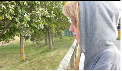
We made this shot showing the famale character looking out over the barrier. Again we were limited with where we would film the practise shots so the setting in this shot is not ideal, however when it comes to the final piece we will be using the same style of shot at the beach and it will show the famale looking out over the sea, we decided this was a good idea as it represents the girl thinking about the future and looking forward to what is about to come in comparison to the rest of the music video which shows reminising about her past.

We decided to use this type of shot as it will effectively give a good view of the location we have chosen to film at which is going to be the sea side. This shot establishes the background which is a significant part of our whole music video as we are wanting to base a lot of it on nature and the sea side fits nicely to the naturalistic enviroment. We will have the famale looking around at the enviroment at this shot.

We picked a low angle shot to include when the female character is shown looking back at the past relationship which the song is about. This show effectively makes her the focus of the music video and shows shes the main important character that the song and video is about. The fact she is looking to the side shows she is looking out to the beach and reminising about her past.

I think when it comes to filming this style of establishing/long shot in the sea side location we have picked it will be an extremely good shot because it will include catherines character who is the focus of the music video aswell as the sea and beach and this links back again to the naturalistic beautiful setting and because it is a long shot it will give a good view of the waves and sea fitting to the peachful mellow feel we are wanting to interpret throughout.
Tuesday, 9 October 2012
Shots
We all decided we wanted to go out with a camera and take some practise shots of the things we wanted to include in the final music video, it also helped us get a feel of using a camera again seen as though we hadn't filmed in while. Being able to get a look at some of the shots we want to include also helped us develop on our story board and make it easier for us to picture what each scene would be like. Here are some examples of the the simplier shots we used. Seen as though we wanted to focus our music video on body language and body movement we got some good close ups of the boy and girl holding hands and Catherines face which showed her emotion. In the final shot that will be in the music video we will have Catherine looking out over the beach


We decided this was a good shot to use as it shows the intamcy and love between the couple and this will link well with the song. Seen as this is a reasonably close shot it makes the audience see how the couple are in love. As you can see the two characters are wearing the same bracelets, this again shows them being a couple.

This is another tester shot for our final piece. In the music video we are going to show the female character sitting on a bench (however we had to use a dining table as we did the practice shots in school) and this will represent how she is now alone. This shot will be in black and white giving the whole scene a mellow feel in comparison to the colour shots of the couple together.


When we did our research into the style of clothing and the style the characters that are usually featured in a indie pop msuic video we found that the female tend to wear quite old fashioned clothing so we thought it would be good to use this in our music video so it links to what is usually common in the genre we have picked.
Sunday, 7 October 2012
Lana Del Rey - Blue Jeans analysis
http://vimeo.com/38985704
I chose to look at the music video Blue Jeans by Lana Del Rey because it fits to the genre indie pop that we are looking at. I also chose to use this one to analyse because it uses not only black and white shots, which is the style we are wanting to include in various parts of our music video but it is also a song and a music video that focuses on love, which again is going to be the focus of the narrative we are wanting to include in our music video.
The main feel of this music video is quite cynical and dark, this is effective by the use of the black and white, however we are choosing to use black and white to give the opposite effect to what this video portrays as we are focusing on happiness and the good thoughts of looking back to a past relationship. The black and white gives the video a vintage old fashioned feel. This is something we want to include in ours giving it a mellow tone.

The first shot shows us the moving water, this gives the video a link to nature which again is an influence we have when it comes to filming our own. The water shown signifies the couples over-powering love that is all around. Lana Del Rey is then in the shot and it gives the illusion of her dreaming, the style of blurry footage represents a figure of her imagination and how her love is confusing and giving her mixed signal. The screen then dips to black, this shows the change in the scene and goes on to introduce the second character. The male is shown with the use of a side shot, and it is clear that most of his face is in a dark light this could signify that he is a 'bad boy' and a dark character, this is reinforced by his dark clothing, tattoos and the fact the character is showing smoking giving a melancholy feel. The black and white effect of the light on his face portrays the sinister dark love he feels.
When we see the next shot showing Lana we can then see the contrast of the bright light that is reflecting on her face against the dark light the male character was shown in, this could be a link to good v evil and signify the difference between the two characters. The innocence of the bright light on Lana's face could suggest she loves him more and her over powering love in comparison to the dark love the male is feeling.
We can then see that the camera is shot by looking down onto Lana, this suggests she is feeling below everyone and feels less important making her seem vulnerable.
The extreme close up showing Lana's face emphasises her emotions and beautiful features, this being the typical thing for a female character, stereotypically attractive and innocent so everyone should love her.
We can then see a shot of Lana watching the male character as he undresses, alot of the focus is on his body movement and shows he is feeling relaxed. This again is a link back to good v evil, where as the male is shown in a blurred kind of shot and the female in a clear looking out at him, the glass she is looking through is the thing separating them and blocking out their love.

The next shot shows the male touching her but she is not touching him, this represents the fact he holds the authority and this is the first shot of the two being together, the male is positioned above her showing he is more important, The shot focuses mainly on their body language and intimacy which is what we are wanting to be the focus of our music video. As we see the male character diving into the water it links back to when we saw the shot of Lana's character at the bottom of the water, this could show the male is going to rescue her, typical hero of the story, saving the female and saving their love. The next shot goes straight to Lana and suggests that she is waiting for him to come and save her. Once she is out of the water she is positioned above him, low angle shot is used and she is in a bright light, her good character that is innocent and pure is now above the male character and is now in charge for the first time in the music video.
 A very long shot is then used to show Lana walking into the water, she is positioned in the middle of the shot making her the focus instead of the beautiful surroundings (This shot also links to nature which is going to be a main part of our music video). The fact that she is walking into the water and we can see the first shot of the crocodile it signifies that she walking to her death, representing the dangerous love. She is referring to the male who she loves as being a dangerous animal and is not safe for her and she is beginning to lose control in the relationship again. This is evident again when we see her sinking into the water, the male is over powering her and taking over again bringing her back to where she was at the beginning.

As she is trying to escape and the crocodile is stopping her it link back again to her boyfriend who is not allowing her to be free and will always be stopping her from getting out, the crocodile represents the danger that is always around her. Her face is then above water which shows she is finally getting away from danger and is swimming to meet the male. The next shot shows the male which his whole face above the water where as hers is only half out, she is the weaker person and unable to be without him. When the camera then shows the two kissing and back to the crocodile it suggests what she is doing is dangerous and it is not true love.

At the end of the music video a shot is used showing the couple and a bright light coming up from beneath the water, this represents the hope that something good is going to come, the two characters are both falling into the water and down to the light, they're going to a better place and the relationship is being saved. This is a typical happy ending to the narrative, this again is something we are wanting to use for ours as it fits well to the love story of the song and the narrative.
Tuesday, 2 October 2012
Copyright Evidence
We all worked together to find a good cover for the song we want to use in our music video. We each decided we would prefer to use a male artist as this makes it fit well with the original song sang by Mumford & Sons. The images below show the emails we went to the cover artists to get permisson.

This is the message our group sent to the artist who made the cover of 'Lover's Eyes' on youtube.

This is the artist giving us permisson.


This is the message our group sent to the artist who made the cover of 'Lover's Eyes' on youtube.

This is the artist giving us permisson.

Thursday, 27 September 2012
Research into logos


I did some research into existing logos of artists and bands that are fit to the indie pop genre. From the images above you can see that no colour is used in these logos. It is evident that images are rarely used in the names of the band or artist and this is consistent through out most of the indie pop genre. We have decided that for our logo we are going to keep the name of the band (which we have not yet confirmed) in simple black bold text. We decided against using floral or swirly style of writing as the cover of the song we have chosen is sang by a male artist. From looking into male bands and artist's logos such as Ben Howard, Noah & The Whale and The Vaccines we decided large font typically in capital lettering or bold typography that is easy to read is something we are wanted to use, this means that we are keeping togething with the usual style used for the genre we have picked.
However we chose to use a image of a red balloon as a main and vital part in the whole of the advertisements, digi-pak and music video. This will give our artist a unique twist without deviating from the genre style. We are going to design the logo/typography font of the artist and then incoperate the design of the balloon into it.
Lana Del Rey's artist font represents her sophisticated and old fashioned style that is evident in both her music aswell as her own unique style. There are no eye catching colours used in this logo however it still stands out and the large capital typography makes it stand out and easily read.
Ben Howard's font is made in a handwritten style. This makes his fit to his style of music that is just him and his guitar. The font is extremely simple with no colours and imagery but it stands out and has a good unique style of writing to it. This style is noticably different to the font used in both Noah & The Whale and The Vaccines logo. This gives them a distinct difference from eachother which is also evident in their music even though they both go by the same genre, both their individual music is different.
Subscribe to:
Posts (Atom)